Introduction
Both Photodash and this documentation are still in beta and undergoing heavy development. Be aware that there will be some bugs and breaking changes along the way. If you run into any issues, feel free to reach out on Github or the Home Assistant Community Forum.
Additionally, these docs, like Photodash itself, are open-source. If you see ways to make the documentation clearer or more detailed, please click "Edit this page" at the bottom of any page and contribute your improvements.
You may find yourself asking, do we really need another alternative frontend for Home Assistant? For a long time, I asked myself that question before reluctantly answering "yes" and developing Photodash.
Why Photodash?

I've wanted a good tablet dashboard setup since my first forays into the smart home with SmartThings in 2018. However, I had one specific box I wanted any dashboard I used to be able to check: a focus on being used as a photo frame. We have young children and take a lot of pictures as a result, and if we were going to put a tablet in the living room, we wanted it to display photos the vast majority of the time, with a sprinkling of home control.
I tried various other options to try and meet my needs with an existing solution, including DAKBoard, Tileboard with some heavy customizations I made, and Home Assistant Lovelace with an attempted fork of the animated background card. Those, and others, are great tools, and the default Lovelace frontend has come a long way on its own, but nothing met my use case without compromise. Photo display was, at best, an afterthought. Thus, Photodash was born, after two years of on-and-off development.
What Makes Photodash Different
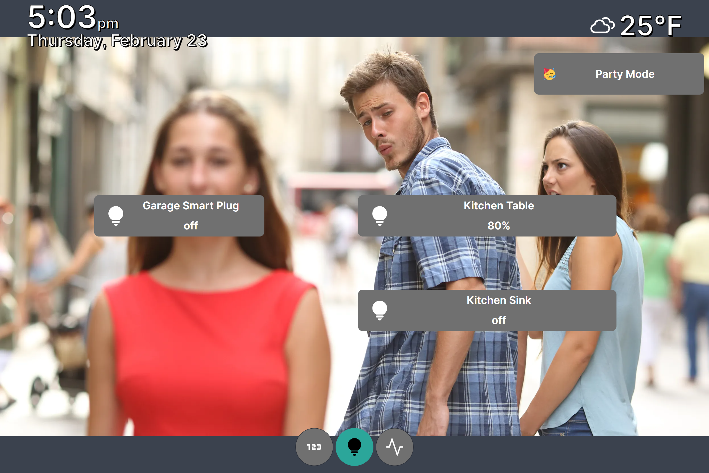
Photos are front and center in Photodash. You can pull photos from a local folder or a Google Photos album, and they will automatically play as a slideshow. When you want to access smart home controls, tap anywhere on the screen, and your configured controls will come into view atop the slideshow. After 30 seconds of inactivity, the home controls automatically fade out, and your photos are again the center of attention.
Additionally, I've focused on making configuration as simple as possible. Knowing that most people will already be using Home Assistant Lovelace, and possibly one or more alternative dashboards as well, I didn't want to introduce a lot of friction in the process of configuring views. As a result, everything is menu driven, with no YAML or JSON files. And tiles support drag and drop repositioning and resizing.
Photodash also includes a few other useful features. It can be used as an audio player, playing an audio file if a user-configured input boolean is turned on. We have used this in our children's bedrooms to turn their tablets into sound machines. Support for on-screen, actionable notifications is also coming soon.
Finally, Photodash has been developed with a heavy focus on performance. It is built on SvelteKit, a lightweight and high performing JavaScript framework. I use Amazon Fire tablets primarily, and with every other dashboard I used, I would run into occasional crashes and would have to do things like set up automated refreshes of the dashboard. Thus far in my testing, Photodash has been rock-solid for days at a time.